Tom Germano
March 23, 1999
I. Introduction to Self-Organizing Maps
II. ComponentsA. Sample DataIII. Main Algorithm
B. WeightsA. Initializing the WeightsIV. Determining the Quality of SOMs
B. Get Best Matching Unit
C. Scale Neighbors1. Determining Neighbors
2. Learning
V. Java Example
VI. ConclusionsA. AdvantagesVII. References
B. DisadvantagesA. BooksVIII. Links
B. Papers
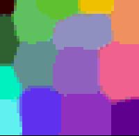
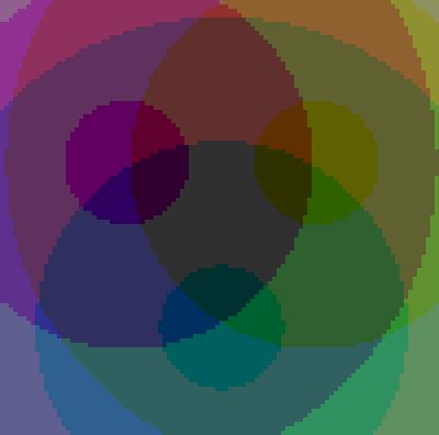
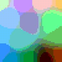
Just to give you an idea of what a SOM looks like, here is an example
of a SOM which I constructed. As you can see, like colors are grouped
together such as the greens are all in the upper left hand corner and the
purples are all grouped around the lower right and right hand side.
A. Sample Data
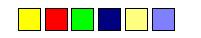
The first part of a SOM is the data. Above are some examples of 3 dimensional
data which are commonly used when experimenting with SOMs. Here the colors
are represented in three dimensions (red, blue, and green.) The idea of
the self-organizing maps is to project the n-dimensional data (here it
would be colors and would be 3 dimensions) into something that be better
understood visually (in this case it would be a 2 dimensional image map).
In this case one would expect the dark blue and the greys to end up near
each other on a good map and yellow close to both the red and the green.
The second component to SOMs are the weight vectors. Each weight vector has two components to them which I have here attempted to show in the image below. The first part of a weight vector is its data. This is of the same dimensions as the sample vectors and the second part of a weight vector is its natural location. The good thing about colors is that the data can be shown by displaying the color, so in this case the color is the data, and the location is the x,y position of the pixel on the screen.B. Weights
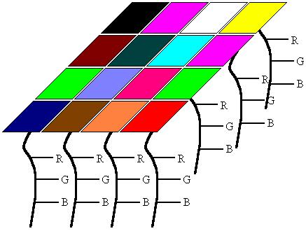
In this example, I tried to show what a 2D array of weight vectors would
look like. This picture is a skewed view of a grid where you have the n-dimensional
array for each weight and each weight has its own unique location in the
grid. Weight vectors dont necessarily have to be arranged in 2 dimensions,
a lot of work has been done using SOMs of 1 dimension, but the data part
of the weight must be of the same dimensions as the sample vectors.Weights
are sometimes referred to as neurons since SOMs are actually neural networks.
So with these two components (the sample and weight vectors), how can one order the weight vectors in such a way that they will represent the similarities of the sample vectors? This is accomplished by using the very simple algorithm shown here.
Initialize Map
For t from 0 to 1Randomly select a sampleEnd for
Get best matching unit
Scale neighbors
Increase t a small amount
The first step in constructing a SOM is to initialize the
weight vectors. From there you select a sample vector randomly and search
the map of weight vectors to find which weight best represents that sample.
Since each weight vector has a location, it also has neighboring weights
that are close to it. The weight that is chosen is rewarded by being able
to become more like that randomly selected sample vector. In addition to
this reward, the neighbors of that weight are also rewarded by being able
to become more like the chosen sample vector. From this step we increase
t
some small amount because the number of neighbors and how much each weight
can learn decreases over time. This whole process is then repeated a large
number of times, usually more than 1000 times.
In the case of colors, the program would first select a color from the
array of samples such as green, then search the weights for the location
containing the greenest color. From there, the colors surrounding that
weight are then made more green. Then another color is chosen, such as
red, and the process continues.
Here are screen shots of the three different ways which I decided to initialize the weight vector map. I should first mention the palette here. In the java program below there are 6 intensities of red, blue, and green displayed, it really doesnt take away from the visual experience. The actual values for the weights are floats, so they have a bigger range than the six values that are shown.A. Initializing the Weights

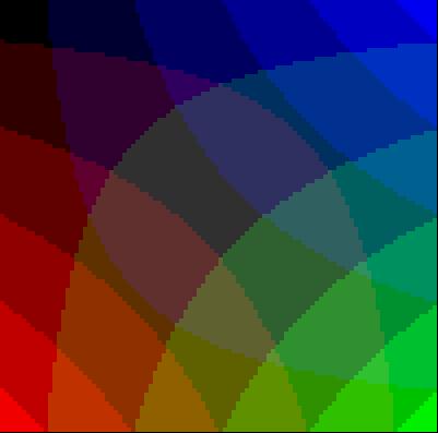
There are a number of ways to initialize the weight vectors. The first you can see is just give each weight vector random values for its data. A screen of pixels with random red, blue, and green values are shown above on the left. Unfortunately calculating SOMs is very computationally expensive, so there are some variants of initializing the weights so that samples that you know for a fact are not similar start off far away. This way you need less iterations to produce a good map and can save yourself some time.
Here I made two other ways to initialize the weights in addition to
the random one. This one is just putting red, blue, green, and black at
all four corners and having them slowly fade toward the center. This
other one is having red, green, and blue equally distant from one another
and from the center.
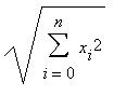
This is a very simple step, just go through all the weight vectors and calculate the distance from each weight to the chosen sample vector. The weight with the shortest distance is the winner. If there are more than one with the same distance, then the winning weight is chosen randomly among the weights with the shortest distance. There are a number of different ways for determining what distance actually means mathematically. The most common method is to use the Euclidean distance:B. Get Best Matching Unit
In the case of colors, if we can think of them as 3D points, each component being an axis. If we have chosen green which is of the value (0,6,0), the color light green (3,6,3) will be closer to green than red at (6,0,0).
Light green = Sqrt((3-0)^2+(6-6)^2+(3-0)^2)
= 4.24
Red
= Sqrt((6-0)^2+(0-6)^2+(0-0)^2) = 8.49
So light green is now the best matching unit, but this operation of
calculating distances and comparing them is done over the entire map and
the wieght with the shortest distance to the sample vector is the winner
and the BMU. The square root is not computed in the java program for speed
optimization for this section.
There are actually two parts to scaling the neighboring weights: determining which weights are considered as neighbors and how much each weight can become more like the sample vector. The neighbors of a winning weight can be determined using a number of different methods. Some use concentric squares, others hexagons, I opted to use a gaussian function where every point with a value above zero is considered a neighbor.C. Scale Neighbors
1. Determining Neighbors
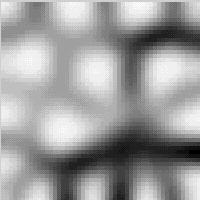
As mentioned previously, the amount of neighbors decreases over time. This is done so samples can first move to an area where they will probably be, then they jockey for position. This process is similar to coarse adjustment followed by fine tuning. The function used to decrease the radius of influence doesnt really matter as long as it decreases, I just used a linear function.
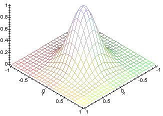
This picture shows a plot of the function used. As the time progresses,
the base goes towards the center, so there are less neighbors as time progresses.
The initial radius is set really high, some value near the width or height
of the map.
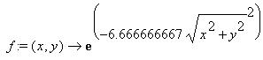
The second part to scaling the neighbors is the learning function. The winning weight is rewarded with becoming more like the sample vector. The neighbors also become more like the sample vector. An attribute of this learning process is that the farther away the neighbor is from the winning vector, the less it learns. The rate at which the amount a weight can learn decreases and can also be set to whatever you want. I chose to use a gaussian function. This function will return a value ranging between 0 and 1, where each neighbor is then changed using the parametric equation. The new color is:2. Learning
Current color*(1.-t) + sample vector*t
So in the first iteration, the best matching unit will get a t of 1 for its learning function, so the weight will then come out of this process with the same exact values as the randomly selected sample.
Just as the amount of neighbors a weight has falls off, the amount a weight can learn also decreases with time. On the first iteration, the winning weight becomes the sample vector since t has a full range of from 0 to 1. Then as time progresses, the winning weight becomes slightly more like the sample where the maximum value of t decreases. The rate at which the amount a weight can learn falls of linearly. To depict this visually, in the previous plot, the amount a weight can learn is equivalent to how high the bump is at their location. As time progresses, the height of the bump will decrease. Adding this function to the neighborhood function will result in the height of the bump going down while the base of the bump shrinks.
So once a weight is determined the winner, the neighbors of that weight
are found and each of those neighbors in addition to the winning weight
change to become more like the sample vector.
Above is another example of a SOM generated by the java program using 500 iterations. At first glance you will notice that similar colors are all grouped together yet again. However, this is not always the case as you can see that there are some colors who are surrounded by colors that are nothing like them at all. It may be easy to point this out with colors since this is something that we are familiar with, but if we were using more abstract data, how would we know that since two entities are close to each other means that they are similar and not that they are just there because of bad luck?
There is a very simple method for displaying where similarities lie and where they do not. In order to compute this we go through all the weights and determine how similar the neighbors are. This is done by calculating the distance that the weight vectors make between the each weight and each of its neighbors. With an average of these distances a color is then assigned to that location. This procedure is located in Screen.java and named public void update_bw().
If the average distance were high, then the surrounding weights are very different and a dark color is assigned to the location of the weight. If the average distance is low, a lighter color is assigned. So in areas of the center of the blobs the colors are the same, so it should be white since all the neighbors are the same color. In areas between blobs where there are similarities it should be not white, but a light grey. Areas where the blobs are physically close to each other, but are not similar at all there should be black.
As shown above, the ravines of black show where the colors may be physically close to each other on the map, but are very different from each other when it comes to the actual values of the weights. Areas where there is a light grey between the blobs represent a true similarity. In the pictures above, in the bottom right there is black surrounded by colors which are not very similar to it. When looking at the black and white similarity SOM, it shows that black is not similar to the other colors because there are lines of black representing no similarity between those two colors. Also in the top corner there is pink and nearby is a light green which are not very near each other in reality, but near each other on the colored SOM. Looking at the black and white SOM, it clearly shows that the two not very similar by having black in between the two colors.
With these average distances used to make the black and white map, we
can actually assign each SOM a value that determines how good the image
represents the similarities of the samples by simply adding these
averages.
The source is made up of the following three files:
soms.javaThe sources and HTML files are all bundled into this file: wpi-soms.zip
Screen.java
fpoint.java
Probably the best thing about SOMs that they are very easy to understand. Its very simple, if they are close together and there is grey connecting them, then they are similar. If there is a black ravine between them, then they are different. Unlike Multidimensional Scaling or N-land, people can quickly pick up on how to use them in an effective manner.A. Advantages
Another great thing is that they work very well. As I have shown you
they classify data well and then are easily evaluate for their own quality
so you can actually calculated how good a map is and how strong the similarities
between objects are.
One major problem with SOMs is getting the right data. Unfortunately you need a value for each dimension of each member of samples in order to generate a map. Sometimes this simply is not possible and often it is very difficult to acquire all of this data so this is a limiting feature to the use of SOMs often referred to as missing data.B. Disadvantages
Another problem is that every SOM is different and finds different similarites among the sample vectors. SOMs organize sample data so that in the final product, the samples are usually surrounded by simliar samples, however similar samples are not always near each other. If you have a lot of shades of purple, not always will you get one big group with all the purples in that cluster, sometimes the clusters will get split and there will be two groups of purple. Using colors we could tell that those two groups in reality are similar and that they just got split, but with most data, those two clusters will look totally unrelated. So a lot of maps need to be constructed in order to get one final good map.
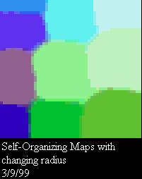
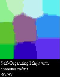
Heres an example of just this sort of exact problem happening. You can see in the picture on the left that there are three shades of purple that are all in one column. Yes those three colors are very similar, but two deep shades of purple are split by a lighter shade of purple. The deep purples are more similar to each other and should therefor be near one another as shown in the picture on the right.
The final major problem with SOMs is that they are very computationally
expensive which is a major drawback since as the dimensions of the data
increases, dimension reduction visualization techniques become more important,
but unfortunately then time to compute them also increases. For calcuating
that black and white similarity map, the more neighbors you use to calculate
the distance the better similarity map you will get, but the number of
distances the algorithm needs to compute increases exponentially.
A. Books
![[Return to CS563 '99 Talks List]](back.gif)