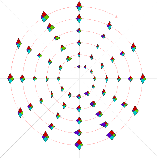
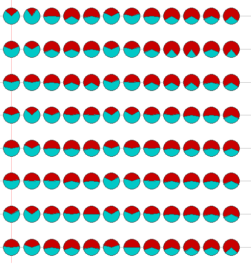
In the first case study, we examined four variables (Dow Jones Industrial Average, Standard and Poor's 500 Index, retail sales, and unemployment) over a several year period. In Figure 17 we see the cyclic view using star glyphs, with Dow on top, S + P on the bottom, sales to the right, and unemployment to the left. In the spiral, 12:00 corresponds to January. Clearly, sales peak in December and unemployment is at a maximum in June and July. However, some anomalies are visible. For example, unemployment in the second year is unusually low for September and October. Also, the Dow and S+P values are lower than normal in year 4 during the early months of the year, which may have influenced the unemployment rate 2 months later. Note that in a linear view of the same data (Fig. 18) is much harder to identify these anomalies. Another interesting view possible in SpiralGlyphics is to use a stacked view and pie glyph with only two variables (Figure 19). This allows us to see how the relative values of the two variables changes over time. Seasonal variations between sales and unemployment are again clearly visible, but also a number of anomalies. This view is useful, since a lot of data can be shown at once without affecting accurate interpretation.
Figure 17. Spiral view of business, sales, and unemployment data.
Figure 18. Linear view of business, sales, and unemployment data.
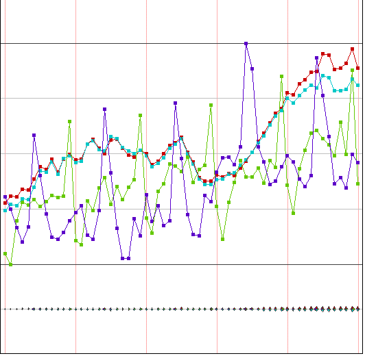
Figure 19. Stacked view of sales and unemployment data.
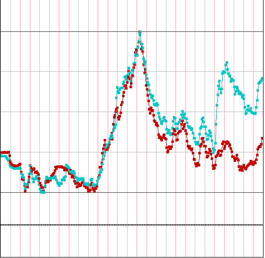
The second case study looks at exchange rate data over a 27 year period, with the U.S. dollar compared against currencies of Italy, U.K, Canada, Sweeden, France, Belgium, Netherlands, Switzerland, Germany, and Japan. In the first view (Fig. 20) we show a stacked view after we use SpiralGlyphics to reorder the dimensions in ascending order on the first month of data being shown. We can see that after 2.5 years of relative stability, a fair amount of variation occurs, with many currencies eventually aligning and some currencies (notably Canada and Japan) dramatically changing their value relative to the dollar. In Fig. 21 we examine the linear view of Canada and Japan to confirm our observations regarding their changed values. Another interesting relationship was that of France and Sweden, which was very close for much of the period of the study, and diverged in the last several years (Fig. 22).
Figure 20. Bar glyph showing several years of monthly exchange rates for
10 countries versus the U.S. dollar. Dimensions have been ordered based
on ascending rates during the first month of the study.
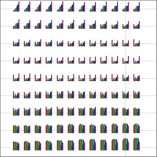
Figure 21. Linear view of Canadian and Japanese exchange rates against the
U.S. dollar.
Figure 22. Linear view of French and Swedish exchange rates against the U.S.
dollar.
![[Return to the SpiralGlyphics Homepage]](little.gif) Back
Back