|
Geochemical
data: heavy metals in moss.
The dataset
includes moss samples from 3 surveys (years 1985, 1990, 1995)
over the area of 300 x 300 kilometers. Total number of points
is 521, and the variables include X, Y (coordinates, m), Cu (copper),
Ni (nickel), Pb (lead), V (vanadium), Zn (zinc)(contents, ppm=parts
per million), year of sampling (1=1985, 2=1990, 3=1995). The purpose
of sampling was to monitor the load of heavy metal pollution from
atmosphere. The concentrations vary from 0 to maximum 114 ppm
(Figure 1).
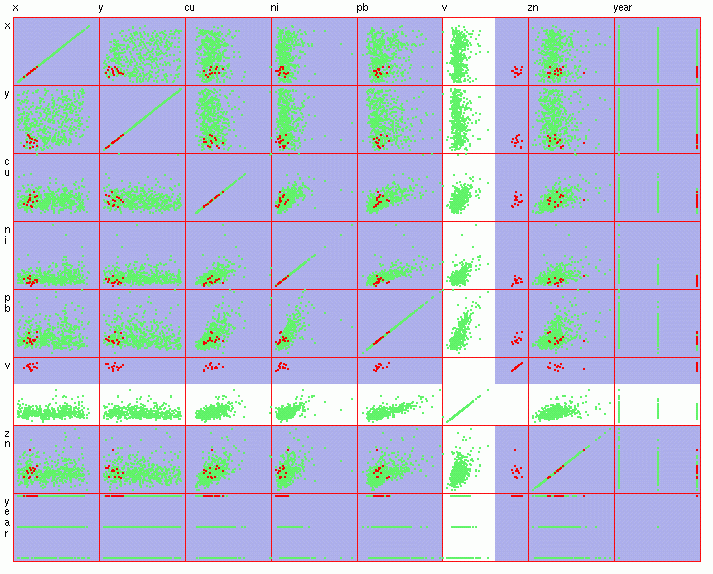
The easiest
way to analyse time-related spatial data is to use statistics
and GIS. Simple statistics, like histograms, can give an idea
about the distribution of values, but cannot account for any spatial
features. To produce a nice map representation with GIS needs
the raw data to be interpolated into a grid. Time-series analysis
can be applied only when the same locations are sampled each year,
or when the data has been interpolated first. Considering the
sparse and irregular sampling, and that different locations were
sampled during three surveys, any kind of interpolation would
introduce errors and uncertainties into the data layers. Further
analysis with interpolated data would not give reliable results.
This is especially true when the concentrations of metals are
relatively low.
What one
would like to get out from the analysis of the data is:
1) identify
and deal with outliers (almost always present in geochemical data),
2) query
high-valued samples and their location within the area,
3) visualize
trends over the years.
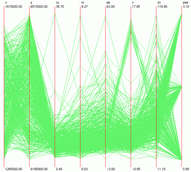
Figure
1.
Figure
2.
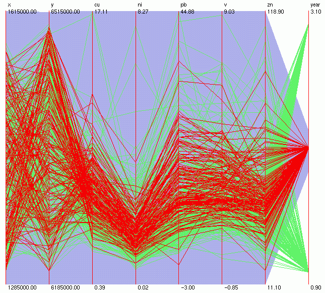
Regarding
outliers, the highest value for Cu (about 34 ppm) seems to compress
the rest of the samples that are in the low range (Figure 1).
However, brushing that maximum value can show that the same sample
contains high amounts of other elements as well (and maximum for
Pb). Instead of removing the multivariate outlier, we can leave
this sample out and rescale the axes for Cu and Pb using their
next highest values as maximum (Figure 3).
One cannot
miss a nice cluster of samples with high levels of V (Figure 1,
Figure 2). Brushing those samples (Figure 3, Figure 4) shows that
they are all: related to year 1995, have the same composition
concerning the levels of other metals, and are located in SW corner
of the area. This could indicate a local source of point pollution
that appeared only after 1990.
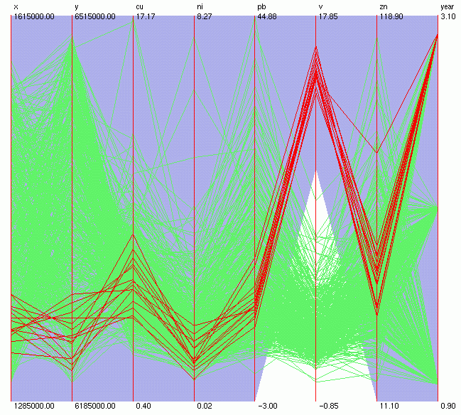
Figure
3.
Figure
4.
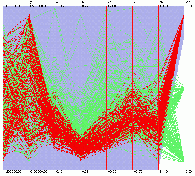
How are the
levels of metals changing in time? After rescaling the V axis
(and excluding the above-mentioned cluster) the samples can be
brushed by year (Figure 5, Figure 6, Figure 7). We can see a decrease
in the concentrations during the years, with levels of Pb and
Ni showing the biggest drop.
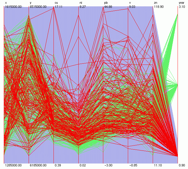
Figure
5.
Figure
6.
Figure
7.
Data courtesy
of SGU (the Geological Survey of Sweden).
Katrin Grunfeld
katring@geomatics.kth.s
|