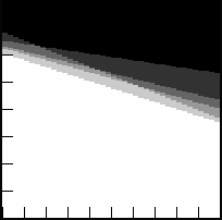
For scalar values, such
as height of the hot gas layer, this can be shaded plot on the back wall, with
time represented from the left to right and the simulation values combined as
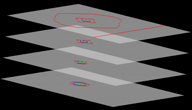
in the DSSFMS case (Fig. 1). Some nestings of isosurfaces are possible, but we
found stacked slices of time-dependent contour lines (one slice per simulation)
was easier to interpret, as long as the number of simulations is relatively
small. Figure 2 shows the expansion of a single isotherm over time (time coded
by color) as predicted by four different simulations.