| Hidden Node 1 | Hidden Node 2 | Output Node | ||||
| To Output To/From Hidden Nodes From Inputs |  |
 |
 |
|||
|
|
||||||

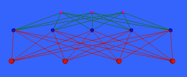
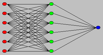
Figure 2.2: A Bond diagram (Craven91). Used without permission.
 |
|
Used without permission. |
 |
|
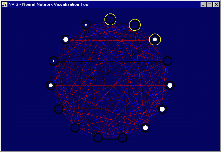
(Wolstenholme99). Used without permission. |
 |
|
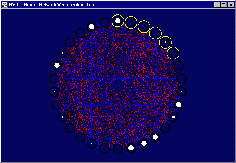
Used without permission. |
 |
|
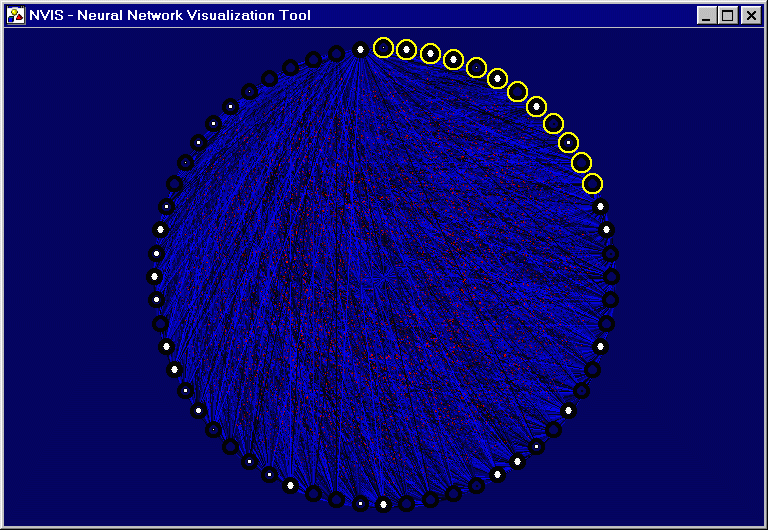
visualization (Hunter99). Used without permission. |

|
|
|
II. Motivations
III. Prototypes
|
|
|
|
|
|
|
|
|