The goal of this chapter is to provide some guidelines for designing successful visualizations. A successful visualization is one which efficiently and accurately conveys the desired information to the targetted audience, while bearing in mind the task or purpose of the visualization (exploration, confirmation, presentation). For any particular set of data there is a myriad of possible methods for mapping data components to graphical entities and attributes. Similarly, there exists a wide range of interactive tools the user may be provided. Selecting the most effective combinations of techniques is by no means a straightforward process.
A visualization may be ineffective for a number of reasons. It might be too confusing or complex to be interpreted by the intended audience, or some of the data may have been distorted, occluded or lost during the mapping process. Other signs of deficient visualizations are the lack of support for view modification or color map control. Even aesthetics can influence the success of a visualization; a visually unappealing presentation can affect an audience's willingness to look at the images. In each of the above cases, some component of the visualization is interfering with the delivery of information to the user.
This chapter first presents design considerations for the components that the authors feel are necessary for a good visualization. Following this we explore some of the common problems found in visualizations and propose some techniques for avoiding these problems. We summarize by revisiting some of the issues presented in the human perception chapter and indicate how they fit into the visualization design process. At a recent Visualization conference it was stated that it is much easier to make bad visualizations than good ones. Hopefully, through reading this chapter visualization designers will gain some of the the skills necessary to make design decisions leading to effective visualizations.
Creating a visualization involves deciding how to map the data fields to graphical attributes, selecting and implementing methods for modifying views, and choosing how much data to visualize. Additional information regarding the data being shown (e.g., labels) and the mapping (e.g., a color key) are also essential to facilitate interpretation and must be integrated into the visualization. The final, less tangible, consideration is the overall aesthetics of the resulting display. In this section we present, for each of these design stages, some issues that should be addressed by the visualization designer.
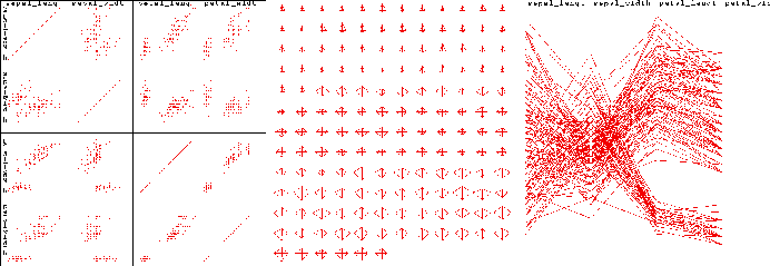
To create the most effective visualization for a particular application, it is critical to consider the semantics of the data and the context of the typical user. By selecting data-to-graphics mappings which cater to the user's domain-specific mental model, the interpretation of the resulting image will be greatly facilitated. In addition, the more consistent the designer is in predicting the user's expectations, the less chance there will be for misinterpretation. Intuitive mappings also lead to more rapid interpretation, as translation time is reduced.
Mapping spatial data attributes, such as longitude and latitude, to screen position is perhaps the most common and intuitive mapping found in visualizations. Some of the earliest visualizations took advantage of the ability of humans to correlate position on the drawing medium with position in the 3-D world. Likewise, with the advent of animation it is obvious that displaying temporally related data sets via animation is reasonably intuitive, with the added advantage of permitting time to vary in both speed and direction.
Other mappings become intuitive when associated with a particular context. For example, mapping temperature to color is fairly common, as many cultures associate red or white with high temperatures. Color has specific interpretations in fields such as cartography (land use classification) and geology (stratographic layer classification), and thus the application domain for the visualization may dictate the logical use for the color attribute.
Height, or alternatively the length of a line, is another useful mapping for temperature, as we associate temperature with the readout on thermometers. In fact, for medical practitioners it may be intuitive to use length for displaying pressure or any other scalar value (e.g., the patient readouts in the Star Trek sick bay).
One of the important considerations when selecting a mapping is the compatibility between the scale of the data field and that of the graphical entity or attribute. For ordered data attributes (e.g., age) it is not reasonable to selecting a graphical attribute which is not ordered (e.g. shape). Similarly, unordered data attributes (e.g., country of origin) should not be mapped to ordered attributes (e.g., length).
With that said, it is, however, sometimes interesting to examine data with non-intuitive mappings, as the resulting image may expose an interesting attribute in the data. For example, mapping time to color along a streakline can reveal variations in particle speeds which might otherwise be difficult to detect. Thus a good rule-of-thumb is to set the default mappings based on the most intuitive selection according to the typical user, but, especially for exploratory tasks, permit user customization.
Except for fairly simple data sets, one view is rarely sufficient to convey all of the information contained in the data. The key to developing an effective visualization is to be able to anticipate the types of views and view modifications which will be of most use to the typical user, and then provide intuitive controls for setting and customizing the views. Useful views, as mentioned earlier, depend heavily on the type of data being presented and the task associated with the visualization. Each view supported should be clearly labeled, and selecting a new view should require minimal actions on the user's part.
View modifications fall into a number of categories, and their inclusion as part of the functionality should be considered based on user priorities.
In all cases, it is essential that the view manipulations are implemented in a manner which is easy for the user to remember and provides suitable accuracy for the task. If possible, direct manipulation (specifying changes on the image itself rather than a separate control or command line) is generally preferred. For example, mouse motion could be mapped to panning, with button clicks invoking zoom operations.
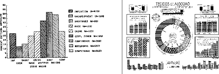
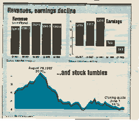
One of the key decisions one makes when designing a visualization is determining how much information to display. This gives rise to two extreme situations. The first, which might be called "gratuitous graphics" occurs when there is very little information to present. Many examples of graphics can be found which convey only 2 or 3 distinct values, such as the percentage of males and females within a particular sample (this actually can be communicated with one number). Others can be found which "pad" the number of pieces of information by deriving additional quantities, such as showing two numbers, their sum, and their difference. In cases such as these it is often more effective to simply display the quantitative values. This requires much less screen real estate (which in many applications is quite valuable) while still getting the message across. It must be remembered that simply because one can create a visualization doesn't imply that one must do so.
The other extreme, namely trying to convey too much information, is also a common problem. Excessive information content can lead to confusion, intimidation, and difficulties in interpretation on the part of the viewer. Important information contained within the data can be lost or de-emphasized on a cluttered display, and viewers may have a hard time determining where to focus their attention.
There are many effective solutions to the problem of excessive information content in a visualization. One method is to provide the user with the option of disabling or enabling different components of the display. In this manner, a user can decide which parts are most important to her, and enable the less important information displays on demand. Another solution is to use multiple screens, with either partial or total occlusions. This method makes better use of screen space while making each of the individual pieces of data readily available.
Another common cause of cluttered displays is large or unevenly distributed data sets. As mentioned in the previous section, data sets may be filtered to remove uninteresting data points, allowing the user to concentrate only on the significant parts. Similarly, uneven distributions, which might lead to some parts of the screen being congested while others are sparsely populated, can sometimes be rectified through scaling of one or more data dimensions.
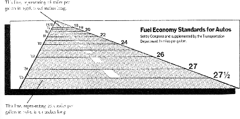
A common problem with many visualizations is that insufficient information is provided to the user to allow unambiguous and accurate interpretation. This supporting information should begin with a detailed caption indicating the particular data fields being displayed and the mappings that were used. Additionally, grid or tick marks should be displayed to convey the ranges and values of interest for numeric fields when absolute judgements are important, and all axes should be labeled with appropriate units. If symbols are being used, a key must be provided, either along the border of the display or within a separate widget. Finally, if color has a significance, sufficient information must be available to allow easy interpretation (e.g., via a labeled color bar). Figure highlights the importance of this supplementary information.
The use of grid and tick marks can be both a boon and a curse to the visualization. Poor choices between which types of markings and the density used can occlude the data being displayed and lead to a cluttered appearance.
The actual positions of the markings can also have a bearing on how readily the data is interpreted. Based on the semantics of the data, certain gaps between markings may make more sense to the user than others.
The designer must also decide which range of values are to be displayed (this decision may have been made in an earlier stage). There is always the risk of misinterpretation when the expected range of values is not shown. For example, when dealing with a percentage, most users would expect the display to range from 0 to 100. However, in many cases this would lead to significant wastage of display space and loss of perceptual resolution (e.g., if all percentages were below 10 percent). Thus the range must be clearly marked to help convey accurate information.
One final rule-of-thumb pertains to visualizations which are presented over multiple frames or windows. It is important to follow a consistent labeling and gridding scheme. Changing the position of labels and keys or the range of values shown (for the same field) can cause confusion and increase the risk of misinterpretation. If range changes are necessary (e.g., for views which differ in level of detail), the label as well as the grid markings should convey the change. Similarly, if different color mappings are necessary, the visualizations must clearly convey this information.
One of the most frequently misused parameters in visualization design is that of color. Selecting the wrong color map or attempting to convey too much quantitative information through color can lead to ineffective or misleading visualizations. Also, since color perception is context-dependent (a particular color will appear quite different depending on adjacent colors), the characteristics of the data itself can influence how the colors are perceived. Finally, it must be remembered that many people are color blind or color confused; it has been determined that as many as 10 percent of all males have some form of color deficiency. The following guidelines can assist in the effective use of color in visualization.
Color can add significant visual appeal to a visualization, but can also significantly decrease the effectiveness of the communication process. Some interface designers advocate an initial design process which only involves the use of grey scales. Once this design has been refined and tested, the addition of color can usually be done in a more effective manner.
Once we have ensured that our designed visualization conveys the desired information to the user (function), the final step is to assess the aesthetics (form) of the results. The best visualizations are both informative and pleasing to the eye. In contrast, a visualization might be so visually unappealing that it detracts from the communication process. An aesthetically pleasing visualization invites the viewer to study it in depth.
There are many guidelines for attractive visualization design which can be drawn from the art and graphics design communities. These include:
In the following sections we examine some of the common problems found in visualizations which can occur even if the steps outlined above are followed. These problems have a deeper root, and relate to decisions regarding what to visualize and what is the most appropriate method to perform use. Some of the problems involve intentional or inadvertent data distortion, which can lead to misinterpretation. Others involve hiding the real data behind "cleaned" versions or excessive supporting graphics. In all cases, steps can be taken to improve the quality and "honesty" of the visualization.
One of the foremost rules of visualization should be that the image is an accurate depiction of the real data. However, throughout history there are examples of how visualizations from distorted data have been used to sway opinions and lie to the audience. These so-called "viz lies" can be found everywhere, from the most prestigious journals to company portfolios. In this section we identify some of the common strategies for creating misleading visualizations, not for the reader to practice them, but to try to avoid them!
To conclude this section we show a number of visualizations which violate one or more of these guidelines, side by side with a more accurate depiction of the data.
Visualizations are designed to convey information, and it is important that the information is meaningful. Visualizations are often created by combining data sets from different sources. However, It is easy to combine unrelated components into a single visualization and identify what seems to be structure, for example, plotting stock market values against occurrences of sunspots. In this case, coincidental relationships can be confused with causal relationships. In deciding what data to combine, it is important to first insure that there is some logic in the combination. One of the problems found in analytic pattern recognition/data mining processes is that these irrelevant relationships are often discovered and reported, which then must be eliminated by a domain specialist. The visualization designer should attempt to avoid creating nonsense graphics before they are presented to users.
Another factor which must be considered is compatibility between temporal and spatial ranges for data being compared. Thus, for example, one (probably) shouldn't compare the sales of a particular product in one year for a particular region of the country with the sales of the same product for a different region and year, unless one is hypothesizing that a migration in interest for the product is occurring.
Compatibility in units also needs to be examined in creating a data set for visualization. For example, products which are measured in terms of price per volume are often mixed with those measured in price per weight. An effective visualization of this data might normalize them both to price per serving.
Finally, there is often a temptation to perform operations suitable for ordered or continuous data on categorical, unordered data simply because the mapping process resulted in an ordered graphical representation. An example might be an attempt to fit a line or curve to a sequence of data points which map a company name to a position on the screen. Obviously, this has no semantic meaning, but because the mapping converted the scale of the data, users might feel that it is useful to perform the fitting.
The key point is that some thought must be put into the semantics of the visualization to insure that it makes logical sense. The following examples show a number of nonsense visualizations.
In a previous section we stressed the importance of including labeled grid or tick marks on visualizations which require quantitative assessment. The excessive use of such markings is an example of what Tufte referred to as "chart junk". Chart junk can be defined as any supplementary (non-data) graphics in a visualization which is not necessary for the accurate interpretation of the data. This additional information can lead to not only visualizations which appear overly complex, but also the occlusion and de-emphasis of the actual data.
Deciding the amount of supplementary graphics to put in a visualization is sometimes a difficult process, since the designer might not know the needs of all the potential users. Because, however, we are dealing with a dynamic, customizable medium (unlike Tufte's static charts), the option exists to allow users to adjust the types and density of this supporting information on the display. In some visualization tasks, users switch between qualitative overviews and quantitative analysis. In the former case, it is usually more important to give the viewer a clear view of the data, while in the latter case, tools to help quantify the elements of the display are much more desirable. Thus a good rule-of-thumb is to provide sufficient tools to support the user's quantitative needs, but with the option of disabling them or altering their degree of presence in the visualization.
A common temptation when designing a visualization is to "clean" the data (often referred to as data scrubbing) to remove outliers, data with missing fields, and points that don't seem to fit the dominant trend found in the set. While this practice can lead to a visualization which is easier to interpret and summarize, it is deceptive (a form of visualization lies), as the critical information may indeed be the data that has been discarded.
Another common practice is to smooth the data using curve/surface fitting or local averaging operations to obtain a more visually appealing result. Again, this is distorting the truth, and may lead to false assumptions and conclusions on the part of the observer. In some visualizations, it is common practice to throw out all of the raw data and only show the smooth approximation derived from the data. This forces the viewer to trust that the approximation is an accurate portrayal of the data, which is often not the case when the designer blindly applies statistical fitting algorithms.
Yet another form of cleaning the data is the process of resampling, where raw data positioned either on a sparse grid or randomly is used to create an approximation on a much denser grid. This can result in a much richer visualization, approaching that of continuous sampling, but again deceives the user into believing the data set is much larger than it actually is. The denser the resampling, the more likely the user is going to misinterpret the data, unless the phenomena being observed has little variability.
It is critical that the user always has access to the raw data and is informed of any scrubbing/smoothing/resampling operation that has been applied. In some domains, such as radiology, users are adamantly opposed to any sort of data smoothing or filtering, as there is danger that the important signal in the data might be discarded as noise. Thus views should be provided that show the raw data set prior to deriving new versions, allowing the user to decide whether the derivation is an accurate representation of the original data.
As mentioned in the chapter on Perception, humans have a fairly limited ability to make absolute judgements of visual stimuli. This implies that visualizations which depend too heavily on users performing accurate measurements of graphical attributes such as position, length, and color will result in problems in interpretation. One means of combatting this human limitation is to design visualizations which either rely on relative rather than absolute judgement, or which are restricted to only using a small number of distinct values for each graphical attribute being used to convey information.
Bounding boxes, grids, and tick marks are all excellent tools for converting an absolute judgement task to one which depends more on relative judgement. By comparing the length or position of a graphical entity against a quantified structure, users can more rapidly determine the approximate value relative to the known levels. Using residuals (e.g., subtracting values from their means) can also change a measurement task to one of deciding whether a value is above or below a particular level.
In this chapter we have presented a number of design rules for creating effective visualizations. These include:
None of these rules are hard and fast; there are exceptions to each, and indeed, there are times when one rule conflicts with another. Designers should be prepared to try many alternatives prior to deciding on a final form, assessing each based on the criteria presented here. However, be strongly advised that there is no substitution for rigorous usability studies with subjects drawn from the anticipated audience. Only after this testing has been performed can the designer be reasonably assured that an effective visualization has been created.